Project Context
The purpose of this project was to improve the usability of healthcare apps and make it easier for users
to access their healthcare information, communicate with providers, and keep their healthcare accounts on one platform.
- Team: Individual
- Timeframe: 5 Weeks
Problem Statement
The Olive app user needs a way to organize and manage their personal and family healthcare accounts.
When required to use multiple apps to access and keep track of healthcare information, it becomes
complicated for the user to keep track of schedules, costs of visits, insurance claims, and communications
with providers.
We will know this to be true when Olive app users are able to link 2 or more healthcare accounts on one platform
and can access tools and personal information across one or more profiles.
Possbile Solution
A possible solution to this problem will be to create an app that will allow the user to integrate their insurance information, medical provider, dental, and vision care. This will give the user access to manage each of their healthcare accounts and information in one platform.
Design Process

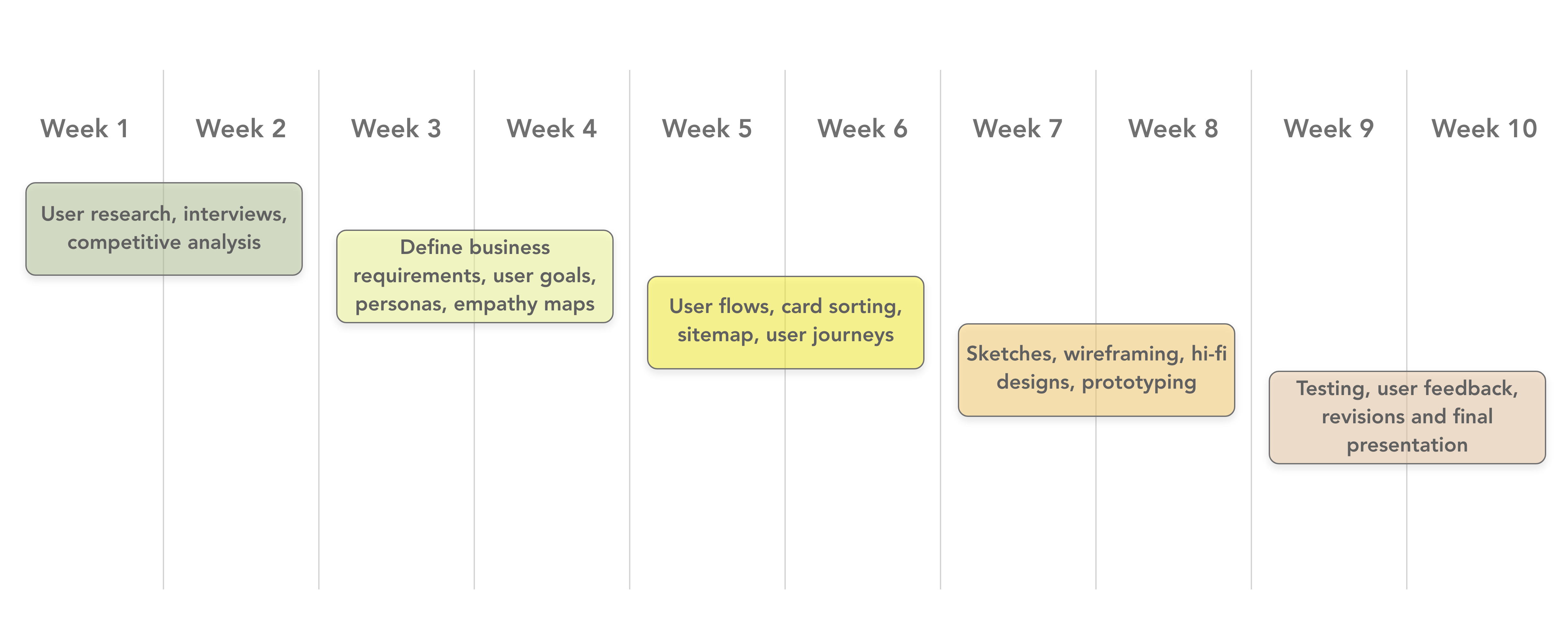
Scope of Work & Timeline
Discover Phase
Design Strategy
Target Audience:
The target audience for this product is any user who is subscribed to an insurance plan
that has separate providers for vision and dental. The user will require all of their medical information on one
platform.
Competition:
Obvious competitors are other private medical providers such as Kaiser Permanente,
MyHealth, MyChart, and Carbon Health. A competitor would be any healthcare provider than offers medical, dental,
and vision in one platform.
Risk/Opportunity:
A risk to creating this app would be integrating the applications and information from a variety of medical providers.
There are not many apps that allow syncing, but one example would be TrueBill, a banking app, that syncs the information
so the user can access it in one application.
This provides an opportunity to create a more useful medical platform to eliminate using multiple apps for medical,
vision, dental, and insurance.
General Tasks:
- Allowing the user to easily schedule appointments with medical professional within their network.
- Enabling the user to correspond with their insurance company and access their medical information when necessary.
- Creating the app to be intuitive for users of all ages and have settings to accommodate their needs.
- Addressing the challenges in navigating through accessing healthcare through the user's network.
Business Objectives:
- Create a competitive responsive web application with the ability to integrate multiple medical information accounts Measured by: Initial user tests and number of medical companies
- Gain 1,000 new users within one month of launching Measured by: Application installation and sign-up count within first 60 days
- Allow integration of 100+ medical provider companies by launch date Measured by: The number of medical accounts synced within the app
Delivered by: 5 to 6 months from project start date
Delivered by: 60 days after product launch
Delivered by: 2 to 3 months from project start date
Interview Questions:
- How many applications do you use related to your healthcare?
- Through which platforms do you access your healthcare information?
- Do you manage the healthcare information for other people?
- What do you find the most challenging in managing your healthcare information?
- What process do you currently use to access your insurance information?
- How do you communicate or schedule appointments with your providers?
- What is the most important feature when accessing your healthcare information?
- When do you find yourself accessing your healthcare information the most?
- What information would you prefer to have accessible?
- What features do you think work well?
- Describe the process you use to schedule appointments.
- What steps do you take to find a provider?
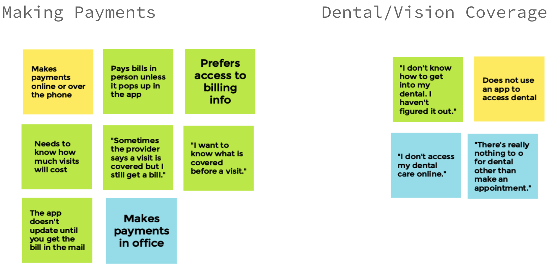
Interview Insights
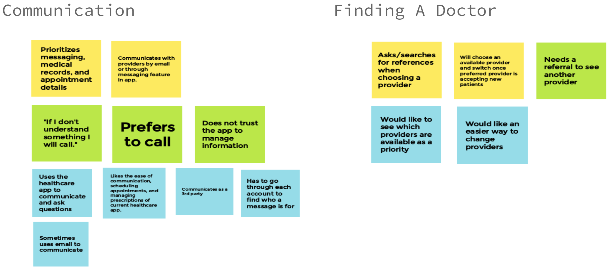
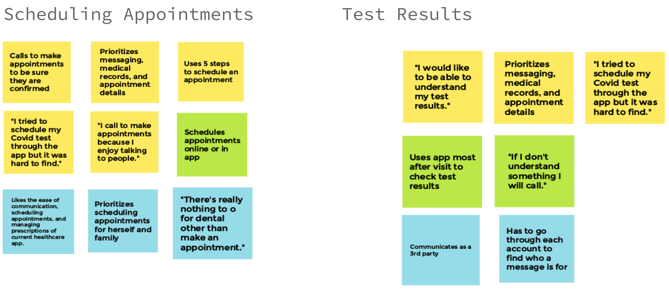
Communication:
- The participants prefer to call and speak with their provider.
- The participants did not find it easy to navigate through the application to access messaging.
- The participants will call their provider or insurance if they need information or clarification.
Finding A Doctor:
- The users found it challenging to find a new doctor that has availability.
- The participants need references and reviews before selecting a new provider.
- The participants need an easier way to receive and share referrals to schedule appointments with new providers.
Making Payments:
- Participants had no preference tot how they paid their bills.
- Participants preferred to know how much their visit would cost prior.
- Billing information is inconsistent between the provider and insurance company.
Dental/Vision Coverage:
- The participants did not have an app to access dental information.
- The participants need an easier way to schedule appointments, especially if multiple visits are necessary.
- Dental/vision information is not included with healthcare information.
Scheduling Appointments:
- Users feel reassured making appointments over the phone.
- The participants will use both the mobile app and desktop app to make appointments.
- The participants need to be able to easily make appointments when managing the information for other people.
Test Results:
- Participants used the app the most after their visits while waiting for test results.
- The participants had a common trend of not being able to understand their test results.
- Participants will prefer to call their provider for more information.
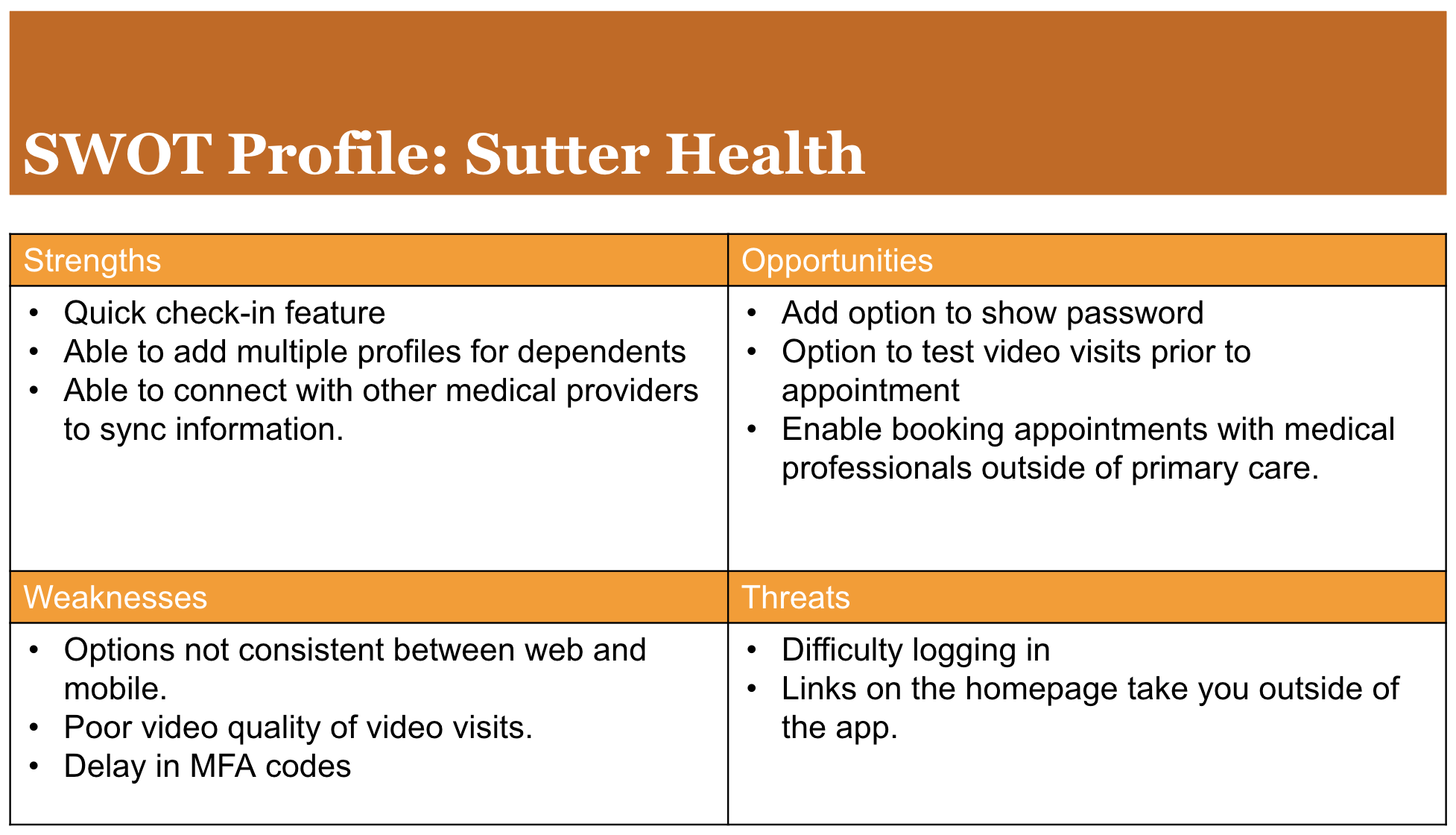
Competitive Analysis: Sutter Health
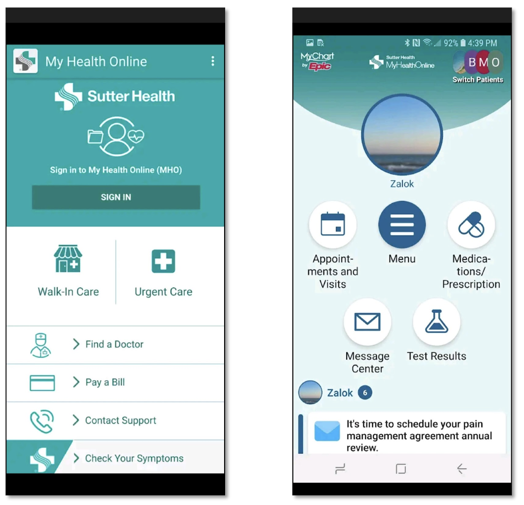
Sutter Health Care provides coordinated care to more than 3 million Californians. It is a not-for-profit organization that puts resources back into its communities. Sutter hospitals serve more of the Medi-Cal patient population in Northern California than any other health system.* With over 12K physicians and 2k advanced practice clinicians, Sutter had over 1.5 million outpatient care visits in the last year.
Define Phase
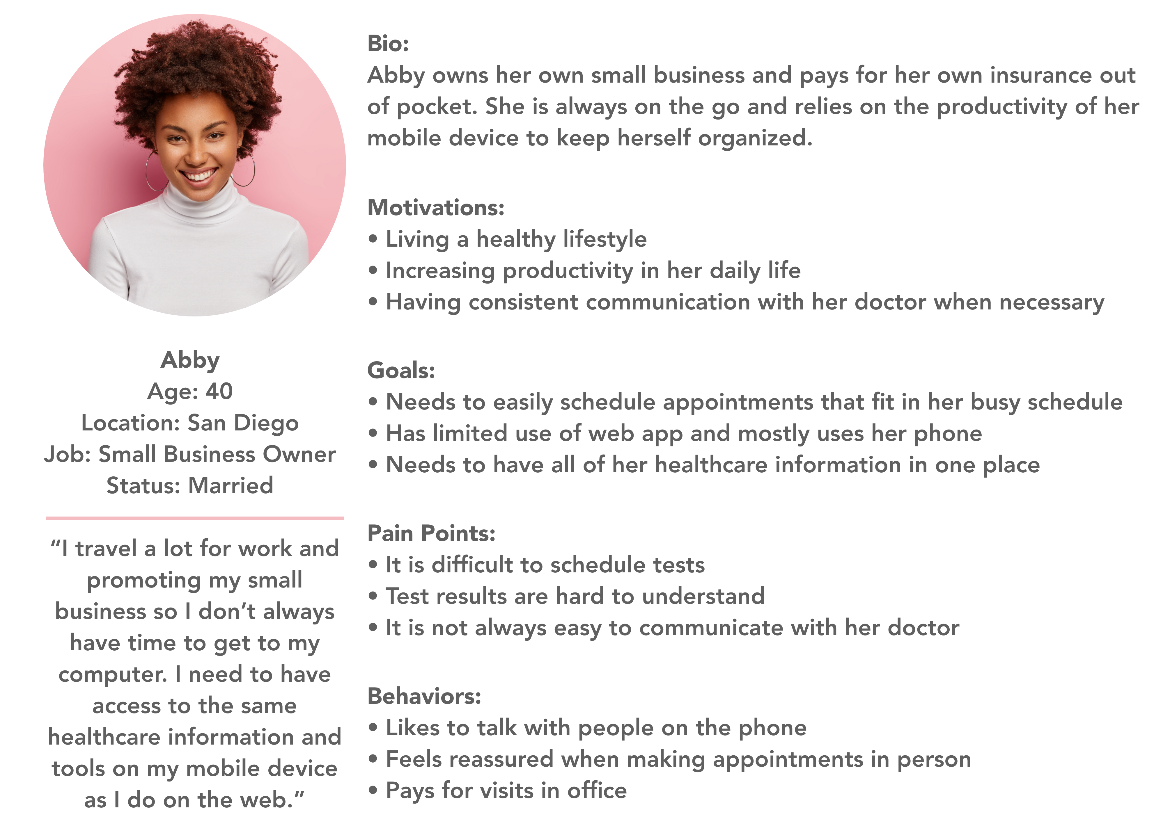
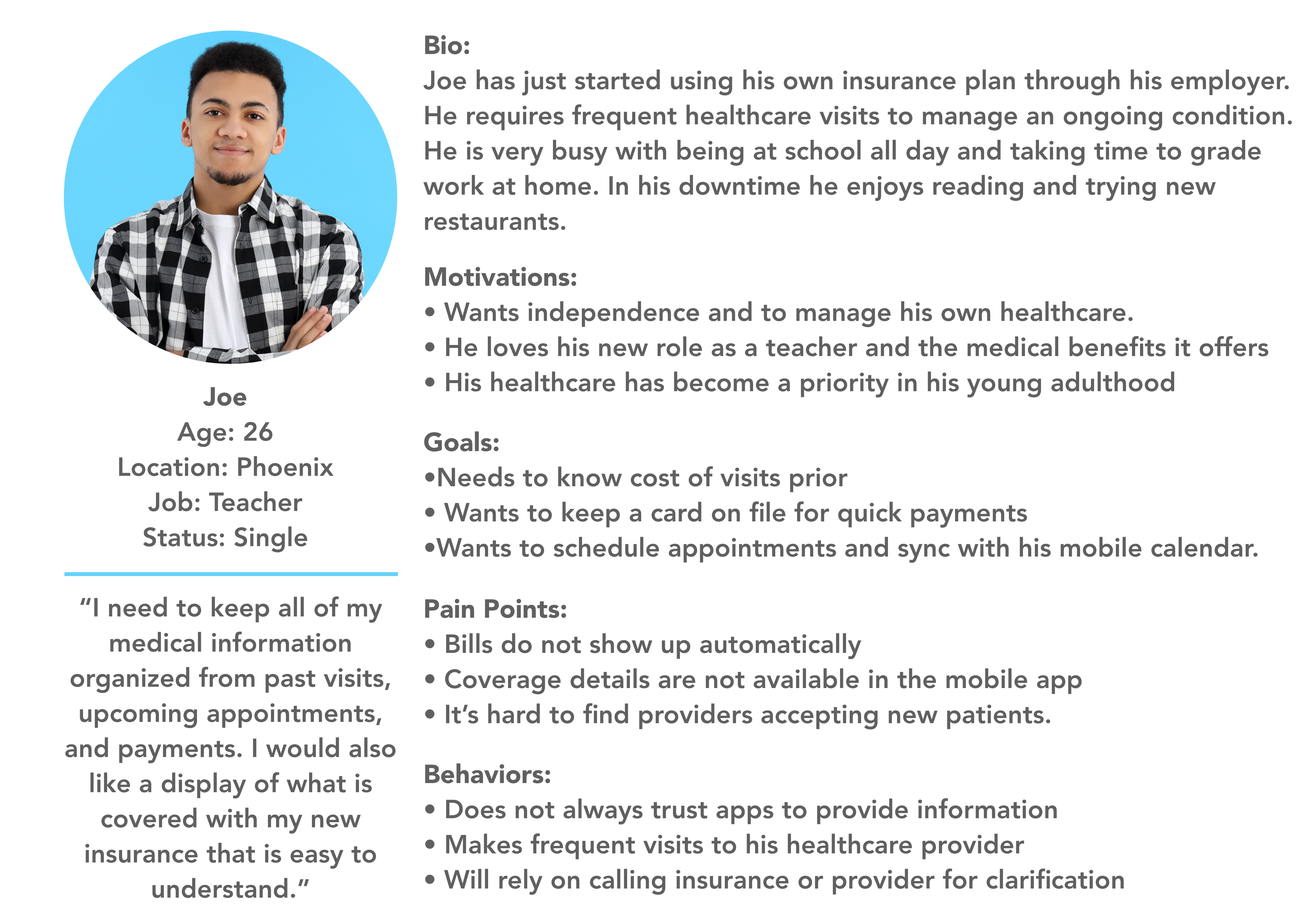
User Personas
Ideate Phase
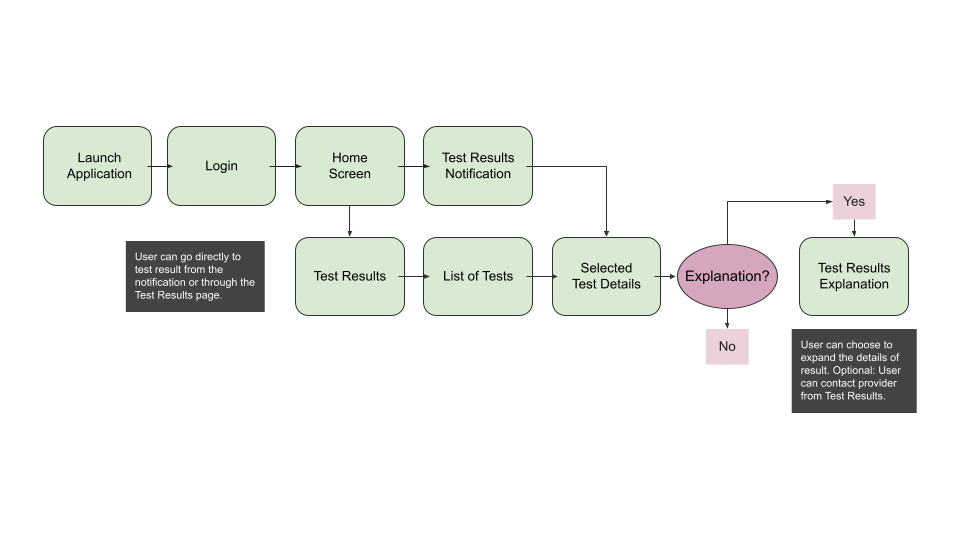
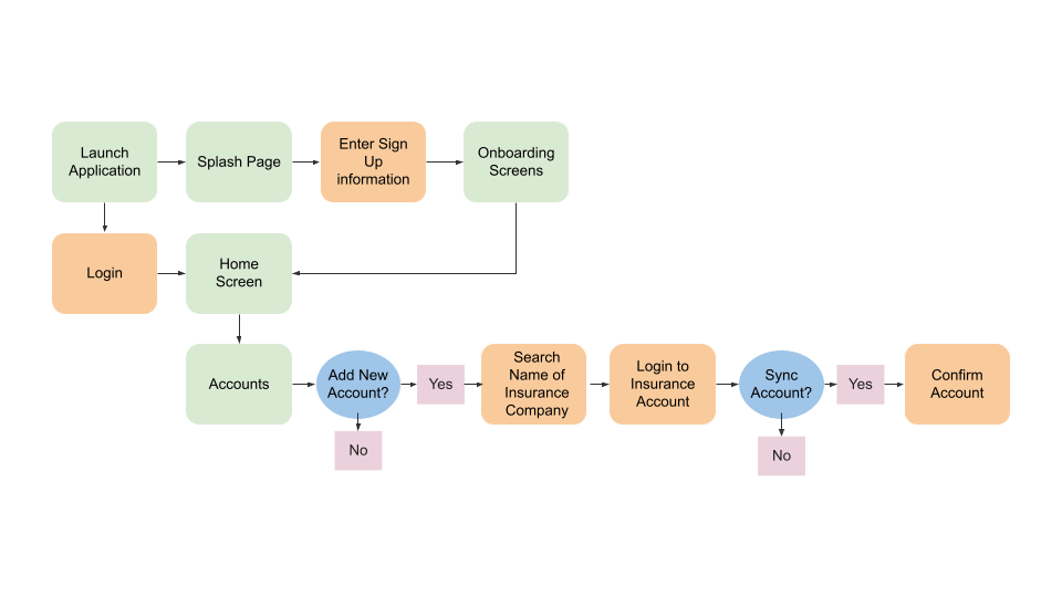
User Flows
Objective:
Abby recently had tests taken at her last visit to her medical provider. They informed her that the results
will be available in their healthcare application and she will get a notification when they are ready.
Entry Point: Launch of application
Success Criteria: Reviewing test results
Objective:
Joe has just enrolled in a new insurance plan through his employer. He needs to link his insurance information within
his healthcare application to be able to view what visits will be covered.
Entry Point: Launch of application
Success Criteria: Adding insurance information to account
Card Sort
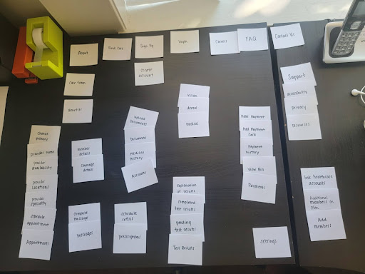
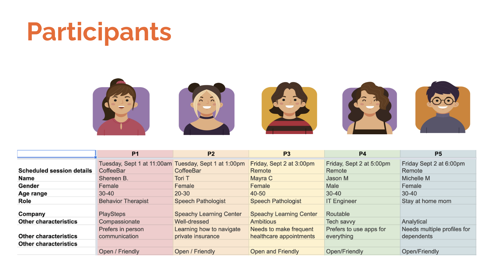
For this task, I asked for 5 participants to do a physical and open card sort for the Olive app. The participants sorted 40 cards into relevant categories.
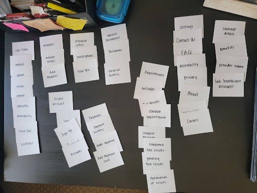
Analysis:
My initial thoughts on doing a closed card sort was that it would be biased based on where I would intuitively find
information searching through a healthcare app. The open card sort gave a lot of insight to what topics can be found in
general categories but other topics could easily placed throughout the application.
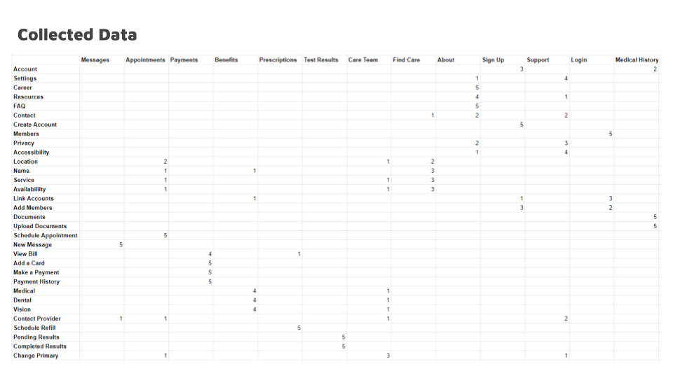
100% of participants agreed on the placement for the topics on payments, test results, and messages. 80% of the
participants had varying thoughts on where to put “settings” and “privacy”. Moving forward, I would like to do more
research to see if a closed card sort would generalize the placement of topics that are currently spread out.
Sitemap

Design Phase
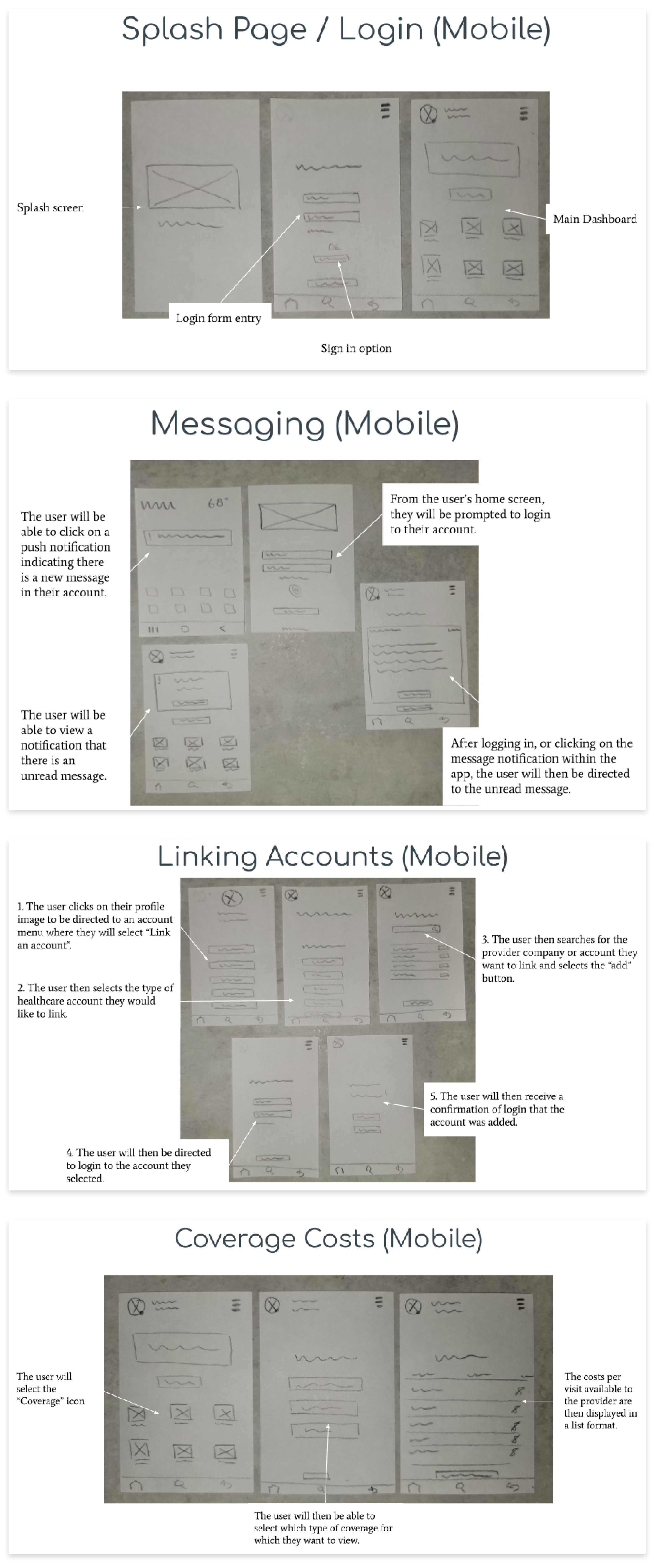
Lo-Fi Wireframes/Paper Sketches
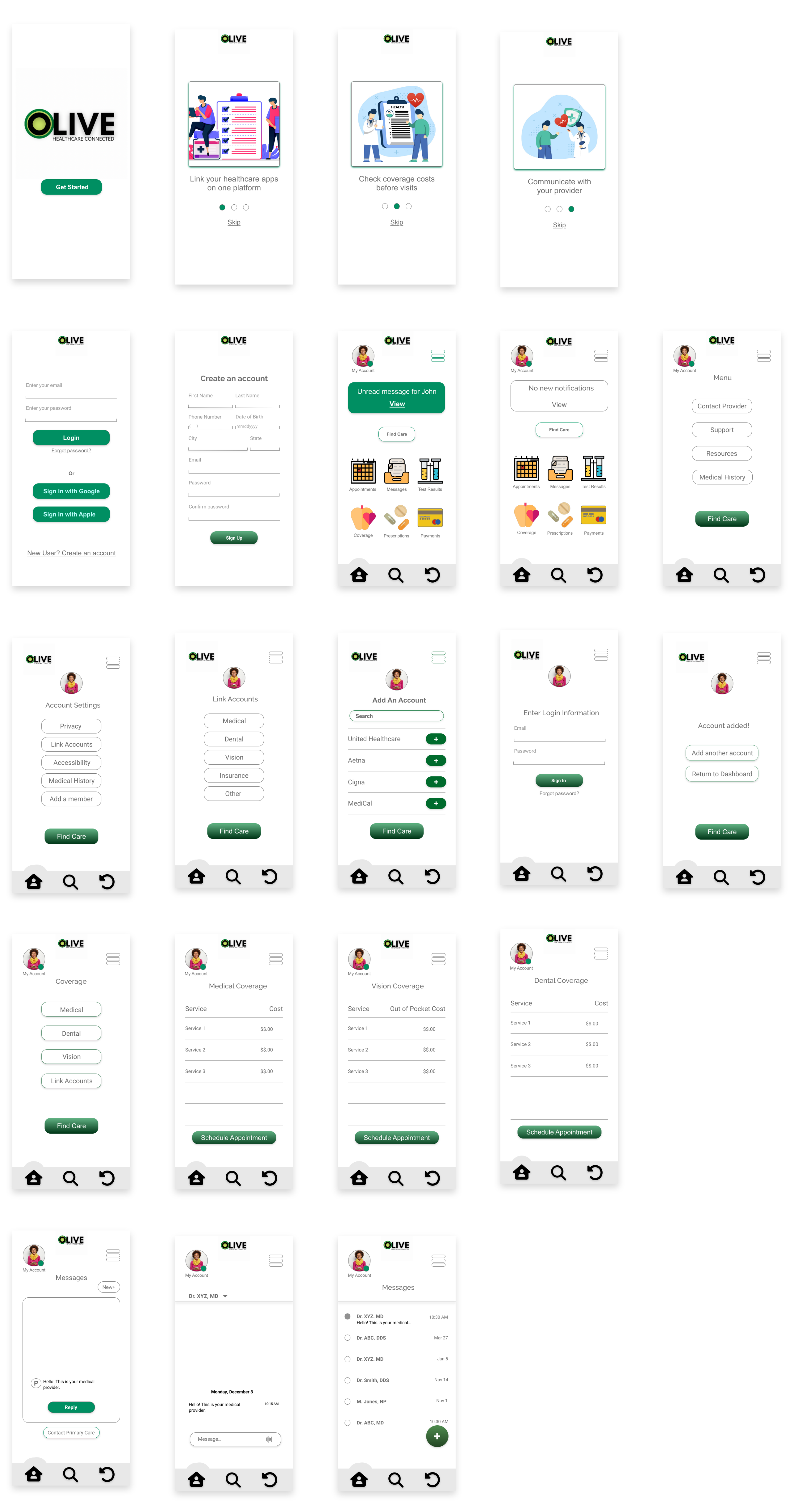
High Fidelity Designs
Testing Phase
Usability Testing
User Feedback
User Errors
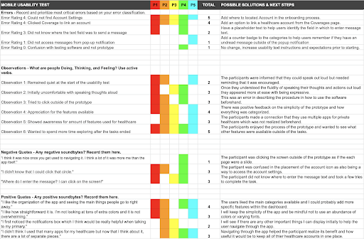
Issue 1: Linking an Account (high)
Problem:
When asked to navigate to their Account page to move forward with linking an account, the users were not able
to find the feature on the dashboard of where to find their Account settings. All 5 participants were challenged with
this issue.
Solution:
To resolve this issue, I will add text on the dashboard and include where to locate Accounts in the onboarding
process.
Issue 2: Coverage Costs (high)
Problem:
When asked to link a healthcare account, the users would navigate to their Coverage page from their dashboard.
Out of the 5 participants, 4 made this initial error.
Solution:
An option will be added to the Coverage page to “Link an Account” as well as in the Account settings.
Depending on the user, the option to link a healthcare account would fall under the coverage category or as an account
settings feature.
Issue 3: Sending a Message(medium)
Problem:
When asked to send a message to a provider, the users were confused as to where to enter their message. Out of
the five participants, two of the users clicked the send button before tapping the empty text field to enter a message.
Solution:
To resolve this issue I will add a placeholder text to help users identify the field in which to enter message
text.
Issue 4: Pop-up Notification (low)
Problem:
When the users bypassed clicking the popup notification and then returned to the dashboard, the notification
was no longer visible. The users were then not able to know if they had an unread message from a provider.
Solution: I will add a counter badge to the categories to help users remember if they have an unread message outside of
the popup notification.
Issue 5: Using Software (low)
Problem: When navigating through the prototype, the users would click through the screen arrows instead of the actual
prototype.
Solution: This error is low, but emphasizes the necessity for clear instructions on how to use the prototype before
testing.
Positive Quotes:
- "I like how all the categories I see are what people would use."
- "I like the organization of the app and seeing the main things people go to right away."
- "I like how straightforward it is. I'm not looking at tons of extra colors and it's not overwhelming."
- "I first noticed the notifications box which I think would be really helpful when talking to my doctor."
- "I didn't think I used that many apps for my healthcare but now that I think about it, there are a lot of separate pieces."
Negative Quotes:
- "Would I be able to add an account I don't see listed?"
- "I didn't know that I could click on that circle icon."
- "I don't see where I can access my account."
- "I didn't know I could click on the screen."
- "I think it was nice once you get used to navigating it. I think a lot of it was more me than the app."
Conclusion
The feedback was constructive and aligned with the participants behaviors while navigating through the prototype. I was able to update my prototype to how the users will intuitively use it best. I made it possible for the users to access the same features in the same amount of steps based on where they would naturally look for what they need. I would like to perform a usability test with a new set of participants to see if the same errors are made, as well as with the same participants to get their feedback on the improvements.